Posts
- I put the
jekyll.pyfile in my GitHub pages folder (i.e.~/username.github.io/). Make sure you read the comments and update the settings where appropriate. - The
jekyll.tplfile is a template file that we’ll give to Jupyter to convert our notebook, so put it somewhere you put your Jupyter templates. - John
- Sarah
- Ashley
- Emily
- Daniel
- Ryan
- Eric
- Brian
- Maria
- Lauren
- Hanukah
- Hanukkah
- Hannukah
- Hannukkah
- Chanukah
- Chanukkah
- Channukah
- Channukkah
- Make copies of all the shapefiles and work on those
- In Excel, open the .dbf file
- Add a column called “Vote” with the percentage of votes for Obama (or Romney, doesn’t matter)
- You cannot save back to .dbf format, so save as .xlsx
- Open MS Access
- Under External Data import Excel and choose the .xlsx file you just created; be sure to select the first row as column headers
- Then export it (under External Data > Export > More) as a dBase File. Pick a name and click Ok
- Take the average D and R percentage and margin of error of the past X number of state polls for a given state (I’ve been using 10) for all states
- Simulate the election outcome by randomly picking a vote percentage value within the margin of error for each state, determining the winner, and allocating the appropriate number of Electoral College votes for the winner
- Do this 1,000,000 times and determine the percentage that each candidate won (or there was a tie); this is a Monte Carlo simulation to determine the probabilities of an outcome
- In 2012, state polls were excellent predictors of the election outcome when considered in the aggregate. It is finally time for the media to stop writing articles about single polls without putting them into the context of the larger picture. If a candidate is up by 2 points in state, we’ll see polls that show a candidate up 4 and tied. Putting out an article talking about a tied race is simply misleading.
- Nate talked about the possibility of a systemic bias in the polls. There appeared to be none when considered in the aggregate.
- A model doesn’t have to be complex to be of value and reveal underlying trends in a set of data.
- Data trumps gut feelings and intuition in making election predictions. Be wary of pundits who don’t talk about their conclusions based on what’s happening in the polls or other relevant data.
- Python rocks!
How to Publish Jupyter Notebooks to Your Jekyll Static Website
This post was written in a Jupyter Notebook. Here’s how I got it onto my Jekyll website.
Download code: Venture
here and download the
following GitHub gists (thanks to cscorley and
tgarc for putting these together): jekyll.py and
jekyll.tpl.
Create and convert your notebook: Go over to your
~/username.github.io/_posts folder and fire up Jupyter:
~/username.github.io/_posts $ jupyter notebook
Once you’re finished writing your notebook, save it, then convert it using the jekyll.tpl template:
~/username.github.io/_posts $ jupyter nbconvert --to markdown
<notebook_filename>.ipynb --config ../jekyll.py
Mind your filename: Jekyll needs your post markdown files named in a specific way in order to pick them up to build, i.e. “YYYY-MM-DD-title-of- blogpost.md”. If you name your notebook with that in mind (e.g. “2017 07 04 How to Publish Jupyter Notebooks to Your Jekyll Static Website”), it will automatically be in the right file name format when you convert it. Once your finished editing just update the title of the post in the markdown file.
Move images: When Jupyter converts the notebook, it saves images into a sub-
directory of the current directory (in our case, _posts/). Unfortunately there
is a bug in Jekyll that throws an exception if it finds a .png file in the
_posts folder (read about the issue
here). Pratically that means you
have to cut+paste the images that were saved in the sub-directory into the
~/username.github.io/images/ folder. If this issue gets fixed that shouldn’t
be a problem anymore and the jekyll.py code can be updated to point to the
saved images in the sub-directory.
Final Steps: After you’ve converted your notebook to jekyll markdown, it’s
time to build. Before you do, go into the markdown and make any final changes,
such adjusting the post title or turning comments on (here’s how you can add
disqus to your site]. Also make sure that the images have been moved
so that the .png files don’t throw an error when you build. Once everything
looks good, run jekyll build and the html files will be generated.
Example
In [1]:
# Normal Distribution
import numpy as np
import matplotlib.pyplot as plt
%matplotlib inline
In [2]:
plt.hist(np.random.normal(size=100000), bins=30)
plt.show()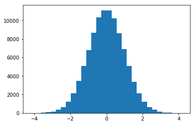
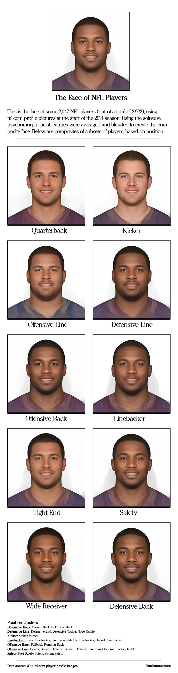
2,047 NFL Player Faces Combined Into One
Here in the U.S. we’re back to work after a long Labor Day weekend and getting excited for the first regular season NFL game on Thursday between the Packers and Seahawks. What better excuse to play around with some facial averaging?
There is no shortage of available football statistics and metrics, but having recently stumbled upon the Face of Tomorrow project, I wondered: just what does the average face of an NFL player look like? Using psychomorph, a bit of Python scripting, and player images from nfl.com, I set out to answer this question.
What I ended up with is the average face of 2,047 available images (875 players did not have a profile image). I also wondered if there were any differences in player build between different positions. After some experimentation, I decided to group some of the positions for simplification (for example, there wasn’t much difference between the average face of Middle Linebacker and an Inside Linebacker).
Here are the results.
Leaked Snapchat Data Uncovers Surprising Patterns
A new year, a new data leak.
On New Year’s Eve an anonymous group or person leaked about 4.6 million Snapchat usernames along with the associated phone numbers, save for the last two digits.
The leak came about a week after Snapchat dismissed the threat – brought to their attention by Gibson Security - in a blogpost: “Theoretically, if someone were able to upload a huge set of phone numbers, like every number in an area code, or every possible number in the U.S., they could create a database of the results and match usernames to phone numbers that way. Over the past year we’ve implemented various safeguards to make it more difficult to do. We recently added additional counter-measures and continue to make improvements to combat spam and abuse.”
Apparently their counter-measures weren’t enough.
Soon after the breach, the alleged hackers responded to requests for comment by The Verge: “Our motivation behind the release was to raise the public awareness around the issue, and also put public pressure on Snapchat to get this exploit fixed,” they say. “Security matters as much as user experience does.” Snapchat CEO responded to the breach in this NBC interview: “We thought we had done enough.”
I examined the data to see if there’s anything we can learn.
What I discovered was something I hadn’t really thought of before, namely information encoded within other information. A straight-forward example is geographical information being encoded in the first three digits of a telephone number. Looking at usernames, I learned that we humans sometimes include quite a bit of information about ourselves in those usernames – for example our actual, real name. So a username can be more than just a username.
Let’s start by taking a look at the telephone numbers. We can see what users have been affected by this data breach by taking a look at the area codes of the phone numbers (to see if you are part of the leaked data, you can search for your name here.) As mentioned in various reports, the leaks only affect North American users. You can find the list of North American phone numbers on Wikipedia: there are 323 American and 41 Canadian area codes. After loading up the data in R (the application for statistical computing), I split the telephone numbers and counted the area codes. There are 76 in total, two from Canada and the rest from the U.S. (download CSV here).
Here are the top 10 area codes:
| Area Code | Frequency | State |
|---|---|---|
| 815 | 215,953 | Illinois |
| 909 | 215,855 | California |
| 818 | 205,544 | California |
| 951 | 200,008 | California |
| 310 | 196,183 | California |
| 847 | 195,925 | Illinois |
| 720 | 188,285 | Colorado |
| 323 | 168,565 | California |
| 347 | 166,374 | New York |
| 917 | 165,420 | New York |
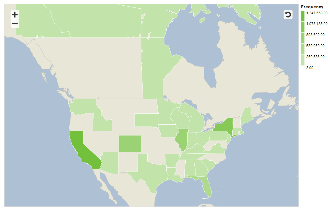
Next I fired up SAP Lumira to take advantage of the great mapping features it has (you can get your free copy here). Here’s a choropleth map showing which states have been affected the most by the leak. If you live in a grey state, you’re not part of the leak. If you’re in a green state, you may want to check to see if you’re data has been compromised (you can check here).
The leaked data also comes marked up with regional information below the state level, which after looking into a bit I’m confident is accurate. Here are the top 10 regional locations affected by the leaks (download CSV here):
| Region | Frequency |
|---|---|
| New York City | 334,445 |
| Miami | 222,321 |
| Chicago Suburbs | 215,953 |
| Eastern Los Angeles | 215,855 |
| Los Angeles | 209,888 |
| San Fernando Valley | 205,544 |
| Southern California | 200,008 |
| Northern Chicago Suburbs | 195,925 |
| Denver-Boulder | 188,285 |
| Downtown Los Angeles | 168,565 |
As this dataset is incomplete, we can only really draw conclusions about what users have been affected by this leak. Some larger urban areas – like my Philadelphia – are fairly low on the list. I wouldn’t conclude that Snapchat is unpopular there, simply that it wasn’t hit as hard.
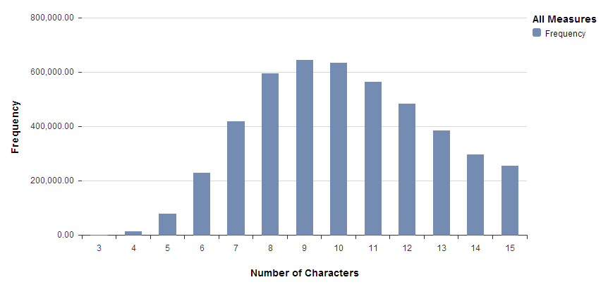
Now let’s take a look at the usernames and see what kind of information is contained in those. To start, we’ll just get a sense of how long these usernames are. What we get is a nice, nearly normal distribution with a bit of right skew. Looking at the data, I would guess that Snapchat requires a username of between 3 and 15 characters. However, there are exactly 5 notable outliers (excluded in the histogram below), users for whom their email address has been published instead of their username (unless these 5 could choose to have their username be their email?). I wonder how these 5 got to be included in this data set.
A lot of usernames appear to be people’s actual names. After Googling random ones, it turns out it’s almost trivially easy to start connecting this data to additional information like names, pictures, Facebook accounts, Tumblr blogs, Twitter accounts, etc.
So what are popular names of Snapchat users? I decided to count how many usernames started with an actual first name. To get a list of first names to search against, I got a list of popular baby names posted by the Social Security Administration and created a list of the top 50 boy and girl names (so 100 names in total) since 1980. Next I counted how many times each name occurred at the beginning of a Snapchat username. Of all Snapchat usernames, about 8% start with a top 100 name. Here’s the top 10 list of most common first names a username starts with:
Another common pattern in usernames is to append a number at the end of your usernames. How many numbers?
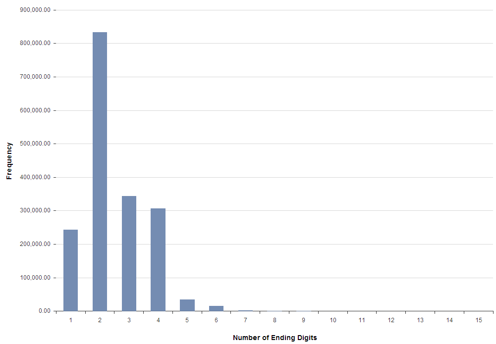
Although two digits is the most common number of ending digits, we’ll take a look at four digits to get a better look at years. What does this distribution look like?
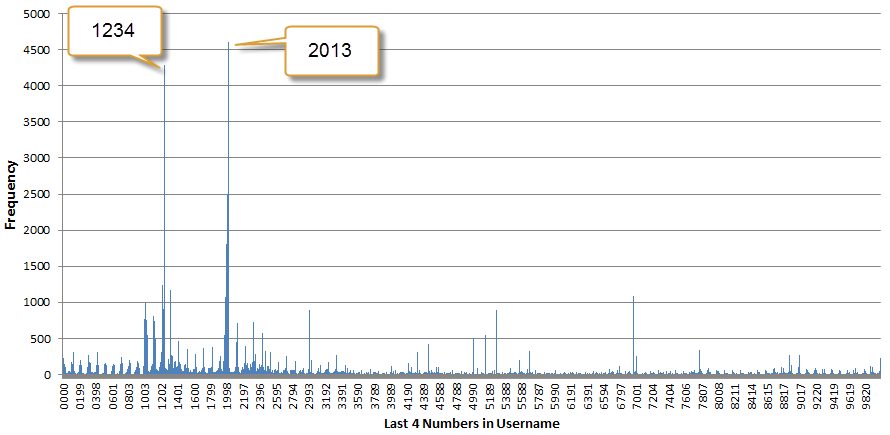
Clearly a lot of numbers other than years are chosen, so let’s zoom into the thick spike around the 1900s. Also, let’s assume that the years are birth years and then turn the years into age. Here is a five to 50 age distribution:
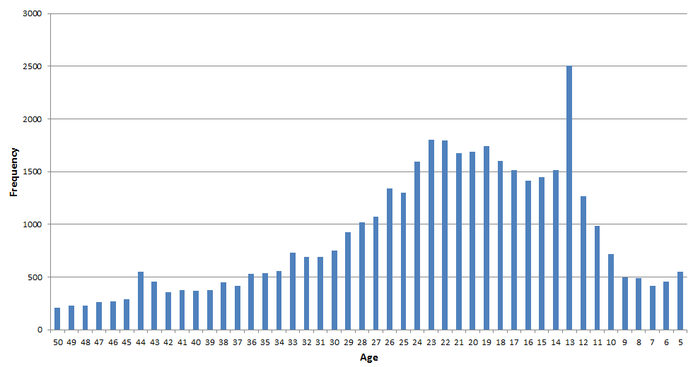
We see a big spike for age 13, which means many people chose to end their username in the number 2000. Same for age 44: ending your username in 1969 was unusually popular. I wouldn’t be surprised if the actual Snapchat age distribution looked similar to this. We see the biggest change of users ranging in age from 13 to 23, so roughly middle school through college. Keep in mind, however, that these conclusions are based on a number of assumptions and should be taken with a very large grain of salt.
Finally, there are all kinds of other factoids contained in these names. The word “cat” occurs twice as many times as “dog”. Lions are twice as popular as tigers. There are over 5,000 sexy Snapchat users. And so on. A username is not just a username, but often tells us a bit more about the person lurking behind that name.
Gibson security has some good advice for those whose information has been compromised: you can delete your Snapchat account, change your phone number, and never give out your phone number if you don’t have to. The moral of the story is that even super-popular services getting billion dollar buyout offers aren’t immune to user data leaks, so be sure you take your online privacy seriously.
Hanukkah or Chanukah? A Look at the Data Reveals an Emerging Consensus
“How Do You Spell Channukkahh?” is the title of song recorded by The LeeVees, and for this year’s Hanukkah holiday I wondered if we could answer the question once and for all.
The Hebrew word for Hanukkah is חנוכה. But what is the English transliteration? Hanukkah? Chanukkah? Hannukah? To find out and settle the question for good (or at least put you on the right side of history), I decided to take a look at the data.
We’ll look at three data sources: SAP’s Social Media Analytics by NetBase, Google Search Trends, and Google Ngram Viewer, which shows us how often a particular term has been used in books. The confusion around the spelling is wether it begins with a C or an H, and just how many N’s and K’s are required. The spellings we’ll consider are:
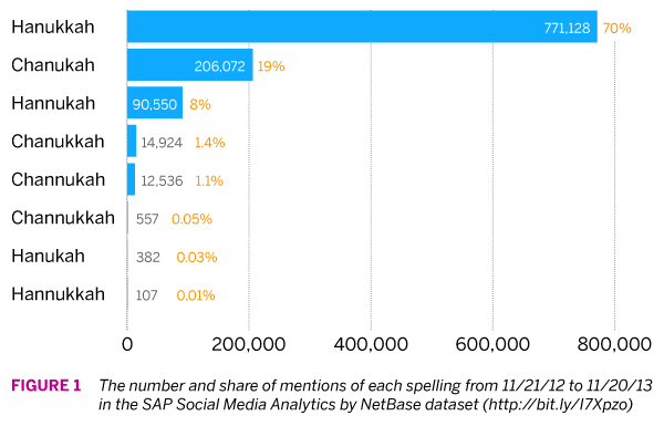
First up, SAP Social Media Analytics by NetBase, which will give us access to a broad set of social data, including Twitter, Facebook, forums, blogs, and more. Figure 1 shows the number of mentions of each spelling over the past year, and the spelling favorite is clear: Hanukkah. Chanukah and Hannukah pull in a distant 2nd and 3rd. The bottom three spellings are so infrequent that we could chalk them up to spelling mistakes.
So how does this compare to our other data sources? Next up, Google searches.
Google provides a wealth of interesting public information, including data on people’s search history. You can study searches via the Google Trends tool; for example, here is a simple comparison between “hanukkah” and “chanukah” going back to 2004. The scale is a bit wonky to understand since they don’t provide the absolute search volume of a term. Rather, everything is scaled using the maximum point on the graph. So in essence, one unit equals 1/100th of the search volume of the term which had the highest search volume for a period of time on the graph (you can read Google’s explanation here).
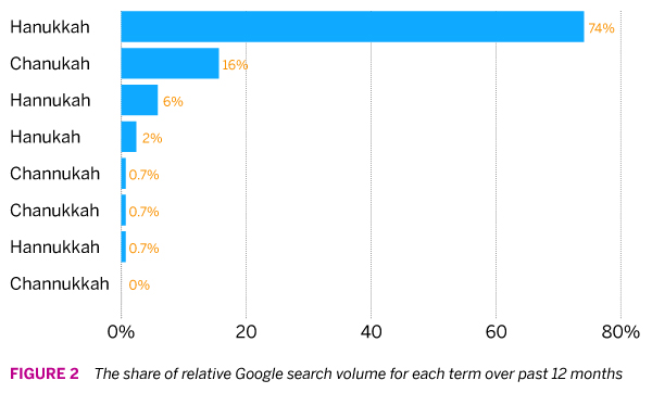
Let’s start by comparing how often each spelling is used in Google searches over the past year vis-a-vis each other. We can see that the top three spellings make up roughly the same share in Google searches as they do in the NetBase dataset. Beyond the top three (which together account for 96% of spelling variants) the bottom diverges a bit more; for example, while “hanukah” appears on 0.03% of the time in the NetBase data it makes up 2% of the share here. Since the Google data is less granular I suspect these small difference are due to noise.
In the end, we draw the same conclusion: about three out of four people spell the Jewish holiday Hanukkah, no C, one N and two K’s.
Now the interesting thing about the Google data is that we can go back in time to see if there are any interesting patterns to detect. I collected the data for our search terms going back to 2005. Unsurprisingly, search volume dramatically peaks each year around the time that Hanukkah takes takes place. In order to more easily compare year-over-year changes, I looked at only the three weeks before, during, and after the week in which the first day of Hanukkah fell (it varies each year). What I found was pretty interesting.
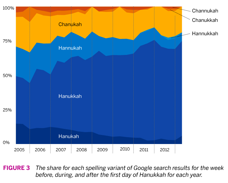
As you can see in Figure 3, it appears that a consensus is emerging on how to spell Hanukkah. The current dominant spelling variant was much less so in 2005, where it accounted for roughly 30-35%. That means over the past decade, adoption of this spelling variant has doubled, mainly at the expense of the other two spelling variants that begin with H. For the C variants, Chanukah remains the most popular option, with the other variants slowly fading away.
Finally, we can go even further back in time by means of Google’s ngram data set of the books its scanned. An ngram is a continous sequence of items from a text; it can include single words, syllables, or sentence fragments. You can explore Google’s data set with its ngram viewer, or download the data itself here. I downloaded the 1-gram data (single words) for ‘c’ and ‘h’ and loaded it into R. What I was interested in is how many books each spelling variant appeared in.
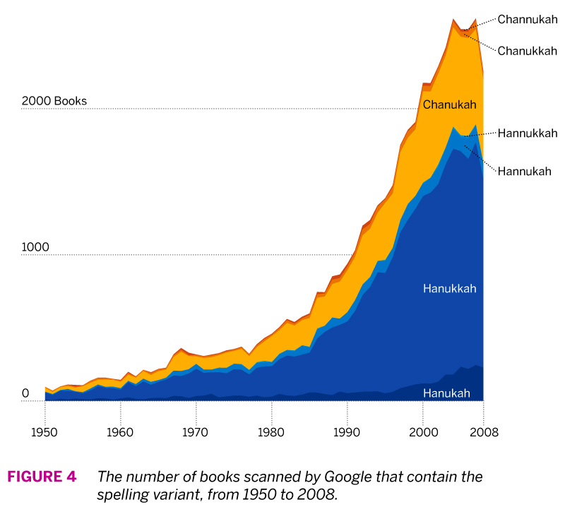
Figure 4 shows the number of books that each spelling appeared in from 1950 to 2008 (the latest year that Google provides data for). While this show us that there’s been an exponential increase of the mentions of the holiday in books since 1980, we can compare spelling popularity more easily by comparing the share of spellings.
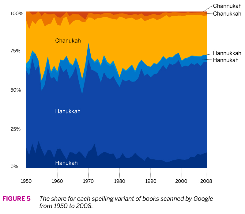
Figure 5 shows us the relative frequency with which each spelling variant has been used. The first thing to notice is that the proportions of each roughly match our previous two data sets. But here the long-term trend has been a bit more stable. The “Hanukkah” spelling does seem to gain a bit more share after 1980, and in general some of the less popular spellings decrease over time.
If you want to know how to spell Hanukkah, you’re best bet is Hanukkah, but you’ll be in good company if you prefer Chanukah. The advantage of using several different data sets is that we can be more comfortable in our conclusions if the data reinforce one another, and in our case we were also able to inspect trends over different time horizons.
Happy Hanukkah!
How to Create a Google Earth Choropleth Map: Chester County 2012 General Election
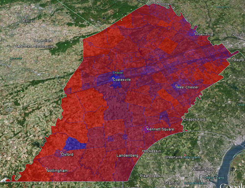
Summary: In this post I will show you how I created a Google Earth choropleth map of the 2012 Presidential Election results of the precincts in Chester County, Pennsylvania. Here is the final result:
Here are the links to some of the tools and resources we’ll be talking about (for easy later reference):
Background
For different scenarios it is useful to understand people’s political leanings on a granular level. For me personally, this interest started because I am currently looking to buy a house in Chester County, but obviously there are many other reasons why such a map might be useful (e.g. for political campaigns who want to maximize resource expenditure).
Most election result data and maps only go down to the level of individual counties, such as this Washington Post map:
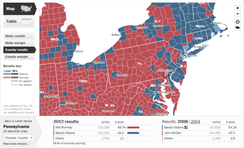
So in a toss-up state, Chester County is a toss-up county: 49.7% Romney and 49.2% Obama. For purposes of looking at real estate, this is however still too coarse. So I wondered how I could get at a more detailed breakdown.
Overview
Here’s what we’ll be doing in a nutshell: get election data and tie it to the map shapefiles of Chester County voting precincts, then converting those shapefiles to KML files so we can view the map in Google Earth.
Getting the Data
The lowest level of political data I could get my hands on were the Chester County (CC) precinct results, which are conveniently located here: Chester County Election Results Archive. Inconveniently, the data for each precinct is contained in a separate PDF. To use the data in our map, we’ll need it all together in one place. So I went through all 200+ PDFs and transcribed the precinct data in Excel (yes it sucked). Here’s the data in CSV format. Note that I only picked out votes for Romney or Obama, not all the other information contained in the precinct reports.
So now we have the voting data, we’ll need the map data (in the form of shapefiles) of Chester County precincts. We could create those ourselves, but who has time for that. What I found was the 2010 Census TIGER/Line® Shapefiles (there’s also the 2008 TIGER/Line® Shapefiles for: Pennsylvania). Click on “Download Shapefiles” on the left, then “Voting Districts” from the dropdown and then select the state and county. You’ll get a package like this one for Chester County.
Now that we have the data and the map shapefiles we come to the hardest part of this exercise: marrying the data with the map.
Map Meet Data, Data Meet Map
So admittedly I am not expert on shapefiles, I have plenty more learning to do there. For a better explanation of what a shapefile is, consult your encyclopedia. Important for us, there are two files that interact: the actual shapefile (.shp extension) which contains the geometry of polygons, and a data file (.dbf extension) which contains data connected to the shapes - in our cases respresenting voting precincts.
From my Google searches the following tasks are best accomplished in ArcGIS, the industry standard mapping software by a company called esri, but it costs. So we will use three other tools: GeoDa, Excel 2010, and Access 2010. Theoretically we don’t really need GeoDa, but it helps to see what’s going on.
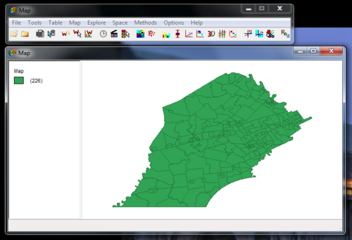
So when you open the shapefile (.shp extension) in GeoDa (free download) you’ll see something like this:
You can also look at the data associated with the shapefile which is contained in the .dbf file. Just click on that little table icon (third from left) and you’ll see something like this:
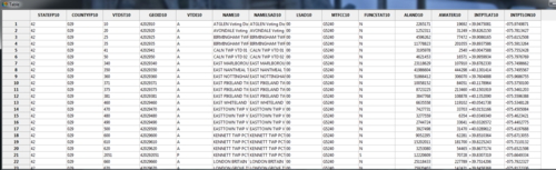
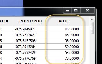
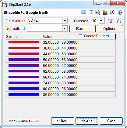
There’s nothing there now that’s really interesting for us, other than the names of the actual voting precincts. What we need is the voting data. In the source data file (the .csv file), we have votes for both Romney and Obama. To combine these in just one column (since the coloring will be based on one variable as contained in one column) I just used the percentage of votes for Obama, with Romney representing the flipside. So a 34% vote Obama would simply mean a 66% vote for Romney (nevermind the 1% third party candidates). This’ll make sense when you take a look at the Category Editor screenshot below and look at the breaks compared to the labels.
At this point we could just add a column and input the voting percentages for Obama for each precinct. This is what I initially did, but editing this in Excel is much faster, so we’ll do that. Here’s what you need to do:
Now when you reopen the shapefile in GeoDa, you’ll see the column you just added:
Color-coding the Map: Choroplethic!
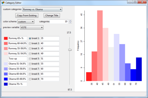
At this point, you can already create a choropleth map in GeoDa. Right-click on the map and select Change Current Map Type > Create New Custom. Play around with the breaks and labels and such. Here’s what I came up with:
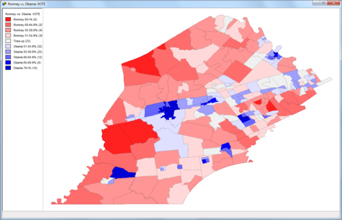
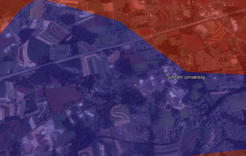
Already pretty cool! But we’d like to see some of the underlying geographic data so we can do some more in-depth analysis of what’s going on. For example, why is there such a big Obama supporting precinct surrounded by Republican precincts in the lower left corner?
This last part is thankfully easy.
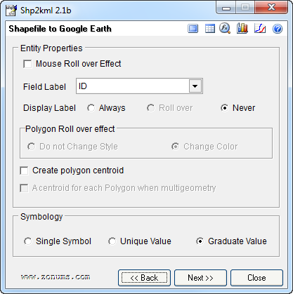
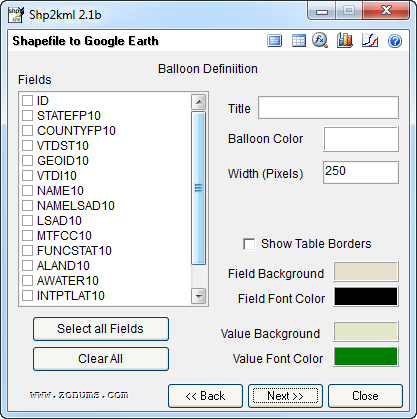
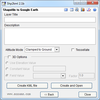
You’ll need to a download a little stand-alone program called shp2kml. This will convert your .shp file (including data) into a .kml file which can be viewed on Google Earth. Here are the settings I used:
On that last screen, click “Create and Open”, pick a file name, and voila, Google Earth opens with your awesome choropleth map: sweet!
Now we can see that in an otherwise sparsely populated district, we find Lincoln University: this likely explains why there is such a pro-Obama precinct in otherwise Republican territory:
Post-Election Model Evaluation Against Actual Results: a Victory for State Polls
So, here we are, November 7, and Barack Obama has been re-elected POTUS. This came as a surprise to no-one who’s been watching the polls and following Nate Silver. Well, maybe to Dean Chambers of Unskewedpolls.com. Poor guy.
Nate did extremely well, correctly predicting all states and the overall election. He had Florida at 50/50, and here it is, still undecided because it’s so close.
And how did my humble prediction model do? Equally well! (Read yesterday’s predictions here.) Here are Nate’s and my predictions for competitive states (any state beyond 100% certainty):
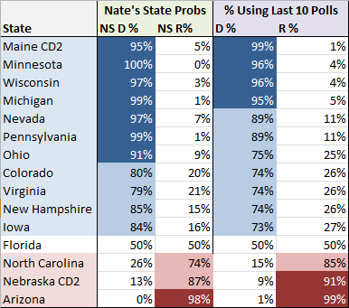
Actual winners highlighted in blue or red. The sole holdout is Florida, which we had at 50/50. Taking a look at my projected likely outcomes for an Obama win:
The first two paths to victory are his actual paths to victory. At the moment, CNN has Obama with 303 Electoral College votes, but if Obama wins Florida, he’ll get the 332. The outcomes above reflect the fact that Obama is slightly more likely to get Florida than not, and in actual fact this is what it’s looking like right now.
Another way to look at the accuracy of the model is to compare the computed state averages based on state polls to the actual election outcomes:
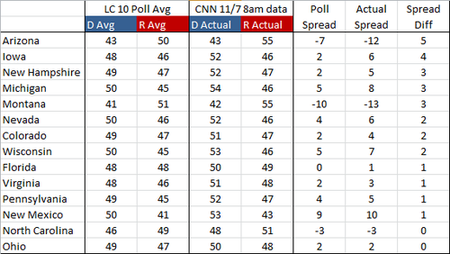
What we’re looking at here is the competitive states, sorted by how much the actual spread (based on election results) between D and R varied from the projected spread. One way to read this is that the undecideds broke more one way than the other. In Arizona, for example, the polls had Obama at 43%, which is what he actually got. Romney, however, picked up 55% of the vote instead of the projected 50%. This could be interpreted by reasoning that the additional 5% that Romney received were undecideds in the poll. The average spread difference in these competitive states was only 2 - not bad! Looks like the state polls were pretty good indicators of how the election would pan out.
Overall, my simple model did extremely well, actually surprisingly so, given how simple it is. The way it works is:
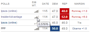
That’s basically it. How many polls to look back in this case was pretty arbitrary (10). Using a lower number gives you possibly a bit fresher set of data (the polls were taken more recently) but leaves you a bit more exposed to potential outliers. For example, if you look at my post from yesterday, you can see that using only the past 5 polls Florida had a probability of 37% Dem to 63% Rep. Here are the past 5 polls:
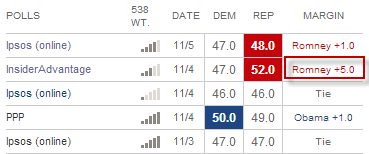
We can see here that the InsiderAdvantage poll was an outlier and had Romney at +5. Using the past 10 polls smoothed this outlier out.
What’s remarkable to me is the accuracy of this model given how dumb it is. Part of Nate’s secret sauce is his weighting of polls. You can see the weights when you hover over the little bar chart. For example, the weight given to the InsiderAdvantage polls was 0.57976 vs. 1.411115 for the PPP poll:
We don’t know exactly how these numbers are determined, but we know that variables such as time, polling house effect, sample size, etc. go into this weight. My model did none of this weighting, which is probably the first area I would start improving it. Nonetheless, the results are quite similar, so the question is, how much bang for your buck do we get from additional complexity. There’s of course also the possibility that this simple model just happened to work out, and that under different conditions a more nuanced approached would be more accurate. This is probably the more likely case. But the takeaway is that you don’t need an overly complex model to come up with some pretty decent predictions on your own.
Another area where the model fudges is in taking the average: it takes the poll averages (e.g. 50% Obama and 48% Obama averages out to 49% Obama), but it also averages the margin of error. Well, the more data you have and the larger the sample of voters that were surveyed, the smaller the margin of error will become. I did not take this fact into consideration and simply averaged the margin of errors, yielding undue uncertainty for each average. My model also did not take other factors into consideration in making the final prediction: no economic factors or national polls - just the state polls.
In all, I finish with the following observations:
Competing with Nate Silver in Under 200 Lines of Python Code - Election 2012 Result Predictions
UPDATE: Post-election analysis here
It’s November 6, and over 18 months of grueling and never-ending campaigning is finally coming to an end. I’m admittedly a bit of a political news junkie and check memeorandum religiously to get a pulse of what’s being talked about. Together with the Chrome plugin visualizing political bias, it’s a great tool.
However, the past few years have been especially partisan and the rhetoric in the blogosphere is rancid. So it was truly a breath of fresh air when I discovered Nate Silver in the beginning of the summer. No bullshit - just the facts. What a concept! So Nate has been become the latest staple of my info diet.
He’s been catching a ton of flack in the past few months for his statistical, evidence based model that has consistently favored Obama in spite of media hype to the contrary. All of the arguments against him don’t really hold much weight unless they are actually addressing the model himself.
One article in particular caught my attention: “Is Nate Silver’s value at risk?” by Sean Davis over at The Daily Caller. His argument basically boils down to the question of whether state polls are accurate in predicting election outcomes, and whether Nate Silver’s model has relied to heavily on this data. After re-creating Nate’s model (in Excel?!), Sean writes:
After running the simulation every day for several weeks, I noticed something odd: the winning probabilities it produced for Obama and Romney were nearly identical to those reported by FiveThirtyEight. Day after day, night after night. For example, based on the polls included in RealClearPolitics’ various state averages as of Tuesday night, the Sean Davis model suggested that Obama had a 73.0% chance of winning the Electoral College. In contrast, Silver’s FiveThirtyEight model as of Tuesday night forecast that Obama had a 77.4% chance of winning the Electoral College.
So what gives? If it’s possible to recreate Silver’s model using just Microsoft Excel, a cheap Monte Carlo plug-in, and poll results that are widely available, then what real predictive value does Silver’s model have?
The answer is: not all that much beyond what is already contained in state polls. Why? Because the FiveThirtyEight model is a complete slave to state polls. When state polls are accurate, FiveThirtyEight looks amazing. But when state polls are incorrect, FiveThirtyEight does quite poorly. That’s why my very simple model and Silver’s very fancy model produce remarkably similar results — they rely on the same data. Garbage in, garbage out.
So what happens if state polls are incorrect?
It’s a good question, although Sean’s answer isn’t particularly satisfactory: he basically says we probably don’t have enough data.
However, this piqued my interest… was it really so easy to emulate his model? I wanted to find out more… the Monte Carlo plugin is $129: screw that. I bit of Googling later and it turns out Monte Carlo simulations are pretty easy to do in Python.
So after creating a few arrays to hold the latest polls for each state (via both RealClearPolitics and 538), I ran the numbers. I’ll perhaps go into the code in a separate post, but for right now, let me just post my predictions along with Nate’s.
Let’s start with state-by-state probabilities. I’ve listed Nate’s state probabilities, and then two version of my predictions. The model I’m using is really super simple. I take the average of the past X number of polls and then run the Monte Carlo simulation on those percentages and margin of errors. That’s how I come up with the state probabilities. The “Diff” column then lists the difference between my predictions and Nate’s predictions.
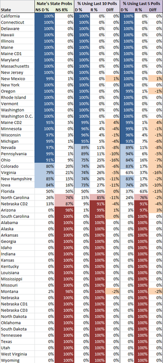
Everything is in the general ballpark, which for under 200 lines of Python code isn’t bad I think! The average difference using the past 10 polls is 5%, while the average difference using the past 5 polls is 4% (looking only at those states where our probabilities differed). Like I said, not bad, and in no case, do we predict different winners altogether (with the exception of a the 5 poll projection calling for Romney to win Florida).
So, who’s gonna win it all? Using the above percentages and simulating an election 1,000,000 times, I get the following, using first the past 10 and then then past 5 results:
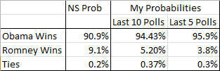
Using the 10 last polls is somewhat close to Nate, but overall, again, we’re in the same ballpark and the story being told is the same. Obama is the heavy favorite to win it tonight with roughly 10:1 odds in his favor.
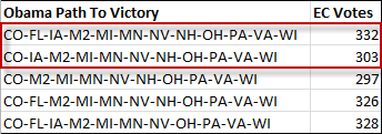
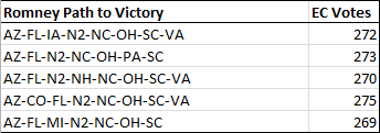
Now let’s look at the most likely paths to victory for each candidate. For Obama, the following 5 paths occurred most often in the simulation:
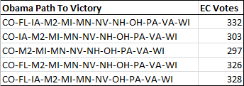
M2 here stands for Maine’s 2nd Congressional District. Maine and Nebraska apportion their Electoral Votes one for each Congressional District (Maine has 2, Nebraska 3) plus 2 for the overall vote winner.
You can see why Ohio is so pivotal for Romney. Here are the most likely paths without Ohio:
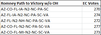
Certainly puts his late push into PA into some perspective.
Well if you do happen upon this post and are actually interested in the Python code, let me know, and I might do a follow-up post looking at the code specifically.
Cheers, and enjoy the election! I’d put my money on Obama!
UPDATE: Post-election analysis here
subscribe via RSS