How to Create a Google Earth Choropleth Map: Chester County 2012 General Election
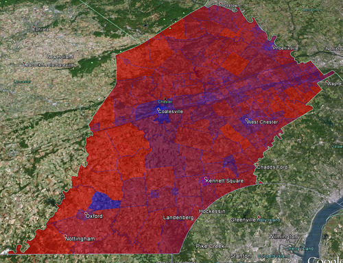
Summary: In this post I will show you how I created a Google Earth choropleth map of the 2012 Presidential Election results of the precincts in Chester County, Pennsylvania. Here is the final result:
Here are the links to some of the tools and resources we’ll be talking about (for easy later reference):
Background
For different scenarios it is useful to understand people’s political leanings on a granular level. For me personally, this interest started because I am currently looking to buy a house in Chester County, but obviously there are many other reasons why such a map might be useful (e.g. for political campaigns who want to maximize resource expenditure).
Most election result data and maps only go down to the level of individual counties, such as this Washington Post map:
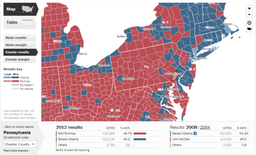
So in a toss-up state, Chester County is a toss-up county: 49.7% Romney and 49.2% Obama. For purposes of looking at real estate, this is however still too coarse. So I wondered how I could get at a more detailed breakdown.
Overview
Here’s what we’ll be doing in a nutshell: get election data and tie it to the map shapefiles of Chester County voting precincts, then converting those shapefiles to KML files so we can view the map in Google Earth.
Getting the Data
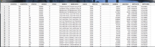
The lowest level of political data I could get my hands on were the Chester County (CC) precinct results, which are conveniently located here: Chester County Election Results Archive. Inconveniently, the data for each precinct is contained in a separate PDF. To use the data in our map, we’ll need it all together in one place. So I went through all 200+ PDFs and transcribed the precinct data in Excel (yes it sucked). Here’s the data in CSV format. Note that I only picked out votes for Romney or Obama, not all the other information contained in the precinct reports.
So now we have the voting data, we’ll need the map data (in the form of shapefiles) of Chester County precincts. We could create those ourselves, but who has time for that. What I found was the 2010 Census TIGER/Line® Shapefiles (there’s also the 2008 TIGER/Line® Shapefiles for: Pennsylvania). Click on “Download Shapefiles” on the left, then “Voting Districts” from the dropdown and then select the state and county. You’ll get a package like this one for Chester County.
Now that we have the data and the map shapefiles we come to the hardest part of this exercise: marrying the data with the map.
Map Meet Data, Data Meet Map
So admittedly I am not expert on shapefiles, I have plenty more learning to do there. For a better explanation of what a shapefile is, consult your encyclopedia. Important for us, there are two files that interact: the actual shapefile (.shp extension) which contains the geometry of polygons, and a data file (.dbf extension) which contains data connected to the shapes - in our cases respresenting voting precincts.
From my Google searches the following tasks are best accomplished in ArcGIS, the industry standard mapping software by a company called esri, but it costs. So we will use three other tools: GeoDa, Excel 2010, and Access 2010. Theoretically we don’t really need GeoDa, but it helps to see what’s going on.
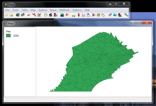
So when you open the shapefile (.shp extension) in GeoDa (free download) you’ll see something like this:
You can also look at the data associated with the shapefile which is contained in the .dbf file. Just click on that little table icon (third from left) and you’ll see something like this:
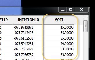
There’s nothing there now that’s really interesting for us, other than the names of the actual voting precincts. What we need is the voting data. In the source data file (the .csv file), we have votes for both Romney and Obama. To combine these in just one column (since the coloring will be based on one variable as contained in one column) I just used the percentage of votes for Obama, with Romney representing the flipside. So a 34% vote Obama would simply mean a 66% vote for Romney (nevermind the 1% third party candidates). This’ll make sense when you take a look at the Category Editor screenshot below and look at the breaks compared to the labels.
At this point we could just add a column and input the voting percentages for Obama for each precinct. This is what I initially did, but editing this in Excel is much faster, so we’ll do that. Here’s what you need to do:
- Make copies of all the shapefiles and work on those
- In Excel, open the .dbf file
- Add a column called “Vote” with the percentage of votes for Obama (or Romney, doesn’t matter)
- You cannot save back to .dbf format, so save as .xlsx
- Open MS Access
- Under External Data import Excel and choose the .xlsx file you just created; be sure to select the first row as column headers
- Then export it (under External Data > Export > More) as a dBase File. Pick a name and click Ok
Now when you reopen the shapefile in GeoDa, you’ll see the column you just added:
Color-coding the Map: Choroplethic!
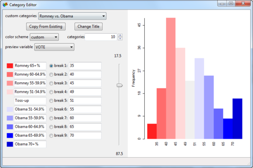
At this point, you can already create a choropleth map in GeoDa. Right-click on the map and select Change Current Map Type > Create New Custom. Play around with the breaks and labels and such. Here’s what I came up with:
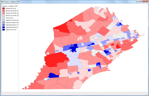
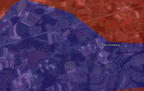
Already pretty cool! But we’d like to see some of the underlying geographic data so we can do some more in-depth analysis of what’s going on. For example, why is there such a big Obama supporting precinct surrounded by Republican precincts in the lower left corner?
This last part is thankfully easy.
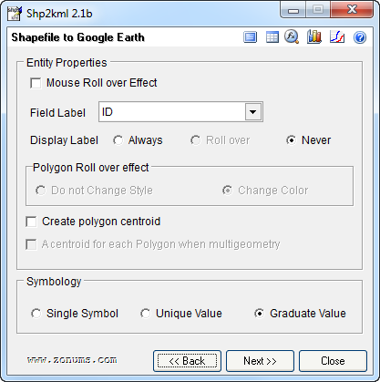
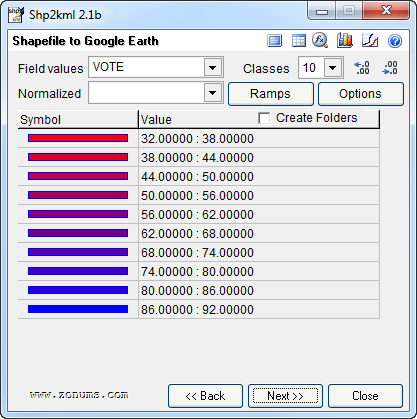
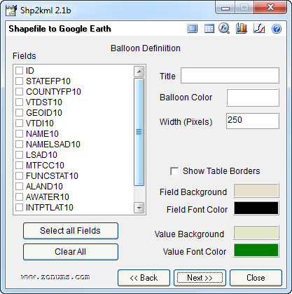
You’ll need to a download a little stand-alone program called shp2kml. This will convert your .shp file (including data) into a .kml file which can be viewed on Google Earth. Here are the settings I used:
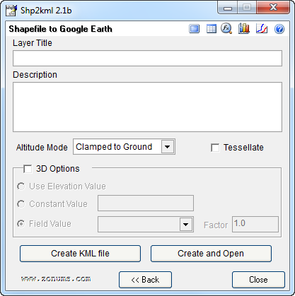
On that last screen, click “Create and Open”, pick a file name, and voila, Google Earth opens with your awesome choropleth map: sweet!
Now we can see that in an otherwise sparsely populated district, we find Lincoln University: this likely explains why there is such a pro-Obama precinct in otherwise Republican territory: